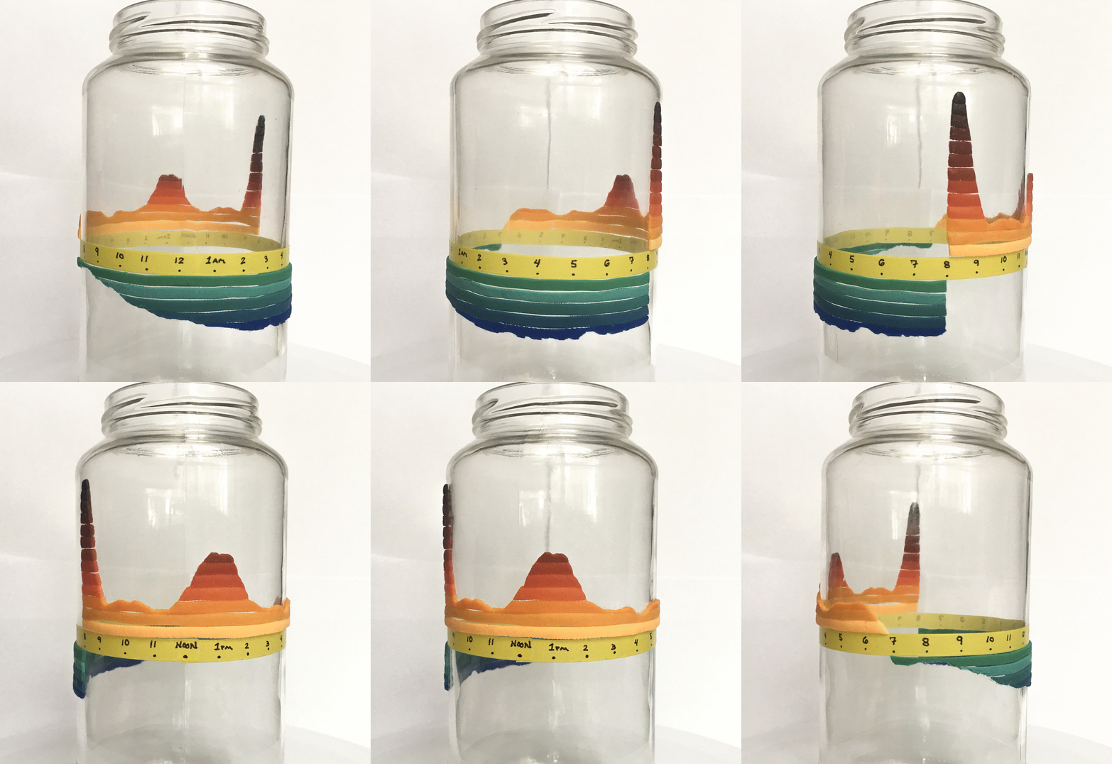
Inspired by the visualization "Why Are so Many Babies Born around 8:00 A.M.?" I played with the 3d form to create a different version of the visualization.
Original: blogs.scientificamerican.com/sa-visual/why-are-so-many-babies-born-around-8-00-a-m

Inspired by the visualization "Why Are so Many Babies Born around 8:00 A.M.?" I played with the 3d form to create a different version of the visualization.
Original: blogs.scientificamerican.com/sa-visual/why-are-so-many-babies-born-around-8-00-a-m


In honor of #InternationalChartDay, my favorite #dataviz from @NPR. From 2014, but still holds up. The title and message are clear. Super simple, but effective.
Original: npr.org/sections/money/2014/10/21/357629765/when-women-stopped-coding


How credit scores work and why you might get different scores. The 3D version of a CFPB graphic I worked on. This is how I envisioned it in my head, except it was sand instead of play-doh.
Original graphic s3.amazonaws.com/files.consumerfinance.gov/f/documents/201702_cfpb_credit-score-explainer.pdf


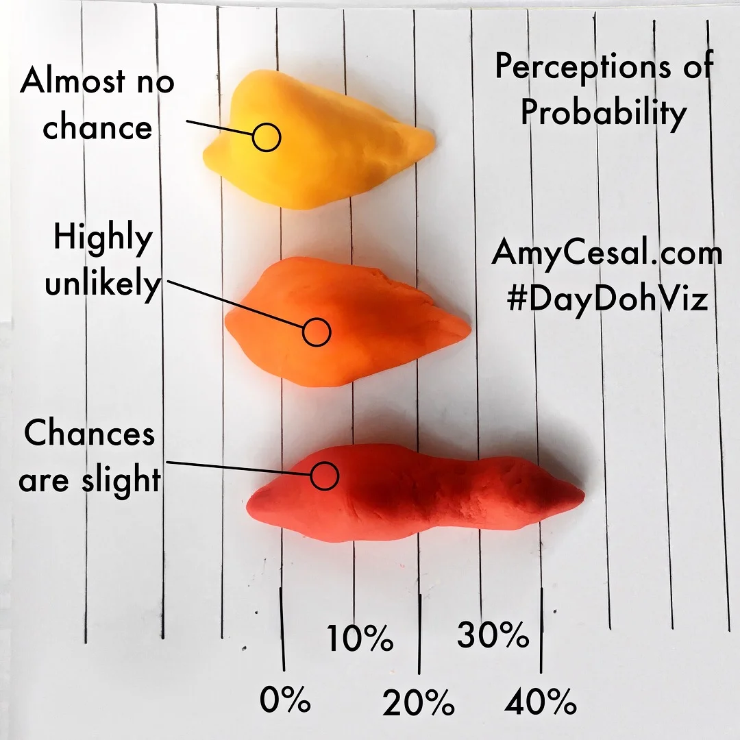
What does it mean when something is “probable”? Is it more certain than “highly likely”? A 3D version of the Perceptions of Probability joy plots.
Original data: github.com/zonination/perceptions
Winner of Most Informative Crafty Data Viz


