Morning Consult Art Direction
Art Direction for Morning Consult
- Date: 2021-2023
- Role: Leading the Data Visualization Team, Providing Design Direction and Strategy
- Stakeholders: Analysts, reporters, and leadership at Morning Consult
- Audience: Potential and current suvey clients
- Problem: Work with novel survey data to make reporter's findings clear and engaging, while maintaining the Morning Consult brand.
At morning consult I had the privilege of building out and leading a team of three fantastic data visualizers, Jes, Sam, and Sara. In leading this team, I felt it was particularly important to stress three things: supporting my subordinates desires to learn and grow their skills, cross-team collaboration, and streamlining day-to-day operations to create space for custom, higher-touch projects. As a team we handled all of the charts that Morning Consult created from daily memos to complex reports.
I had the opportunity to work and learn under Amy as my manager at Morning Consult. She offers expertise on best practices and current standards that were exactly what we needed. Amy is great at seeing the big picture for every piece of data viz, which is something I definitely leaned on her for because I often get caught up in the very small details. Amy has a passion for making data viz more accessible, which I think is desperately needed everywhere. Often, those efforts are considered last if at all, but Amy always kept them at the forefront of our design and decision-making.
- Samantha Elbouez, Senior Data Visualization Designer
I took the position at Morning Consult because I knew Amy would be my supervisor and mentor. And now, while I’m working on charts and data visualization stories all day long, she is often the voice in the back of my head, guiding me to make the best data viz choices possible. Not only is her knowledge of data viz extensive, thorough and creative, she is also one of the best people managers I’ve ever worked with. She encouraged me to try new things and set an example of how to teach others.
- Sara Holcombe, Senior Data Visualization Designer
As a working manager, I was able to oversee the visual style and consistency of Morning Consult’s data visualization output, and continue producing work myself. I particularly stressed maintaining the visual identity of the morning consult brand in our charts, while allowing for experimentation in how we presented information. One way we did this was by building out cohesive “sub-brands” for large reports or packages of content that echoed Morning Consult’s brand, but also fit the subject and allow space for creativity and playfulness.
Below is a selection of work produced by my team and myself at Morning Consult. First, is the report What Sustainability Means to Consumers. For this report the sub-brand leaned in to different shades of green that worked within the Morning Consult brand to fit the theme of sustainability.
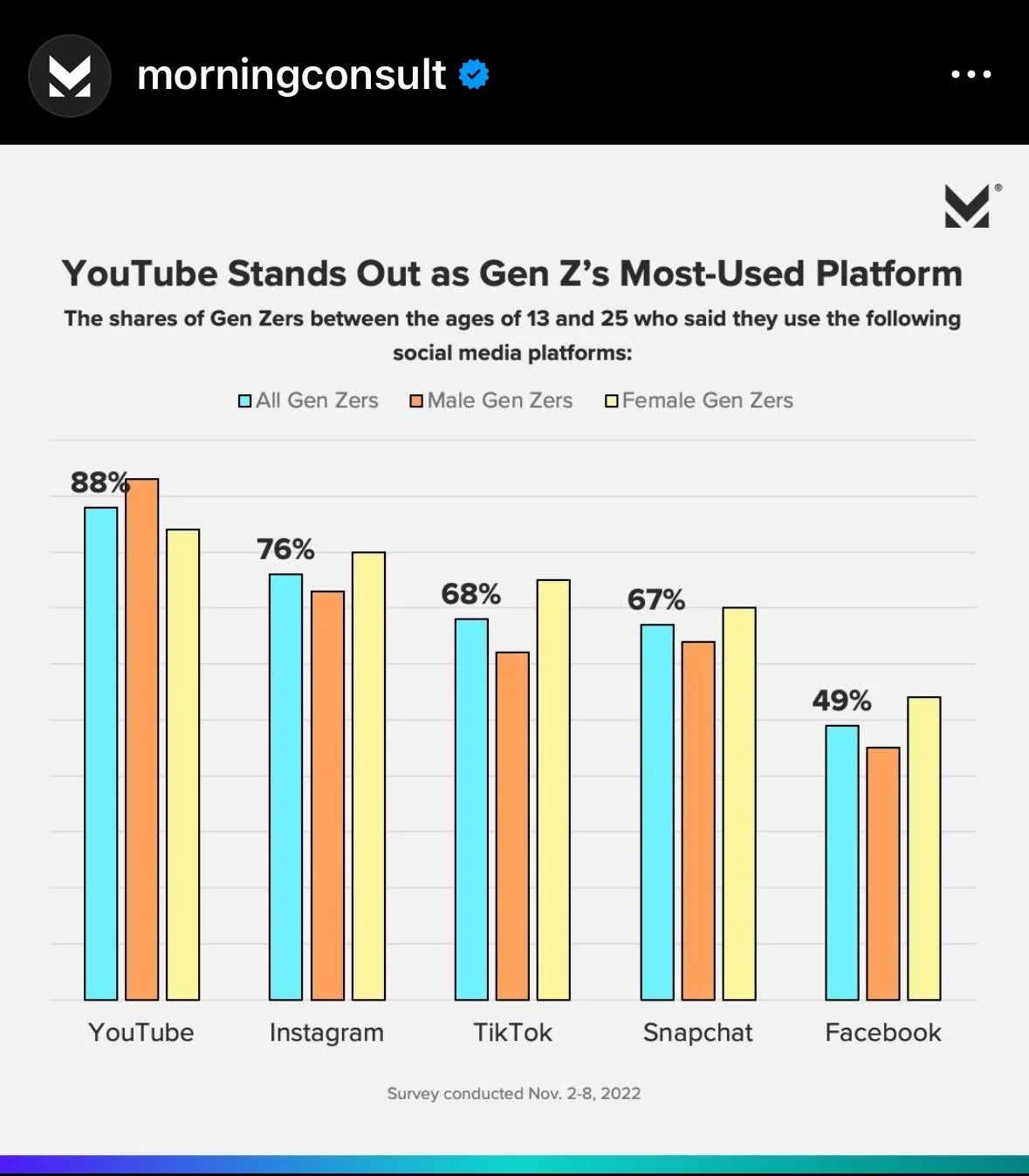
We often built separate, custom versions of charts for sharing on social media designed to work well on smaller screens. It was important to always ensure that such charts contained all of the information necessary for interpretation as they are more easily divorced from the surrounding context than charts embedded in a report.
In our First Look: Consumers’ 2022 Holiday Plans report we pulled different shades of blue, echoing ice and snow and incorporated playful touches like ribbons and bows on bars in a bar chart or snowy textures in a stacked area chart.
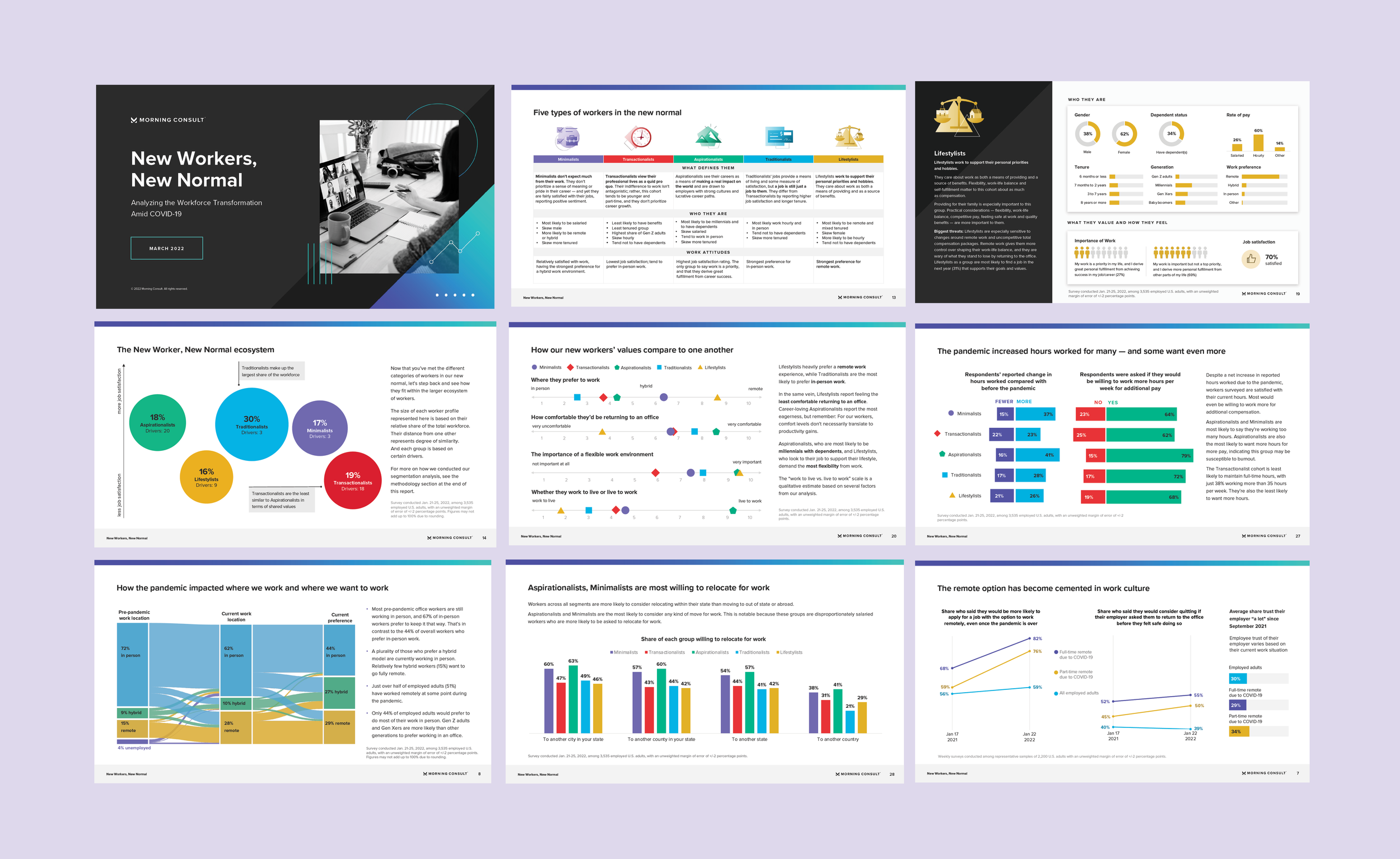
Our New Workers, New Normal report presented data on how the attitudes, aspirations, and habits of workers had changed amid COVID-19. The analyses involved a five group typology of workers, which ran through the whole piece. We used this structure to design our guide, building a custom sub-brand around this typology, with specific colors associated with teach type of worker that we carried through the charts.
In addition to the examples of reports above, I present a series of smaller pieces and individual charts that are illustrative of the work that I art directed at Morning Consult.
In Public Support for U.S. and Domestic Retaliation Against Chine if it Invades Taiwan, we used a spider chart to present complex cross country results about support for different retaliatory actions against a belligerent China.
In the lollipop charts below we used the head of the charts as labels, for countries on the left and to dual encode the classification of either financial or military retaliatory action on the right.
For a large package on the attitudes of Generation Z, we built out a sub brand focusing on bright pastels to give an energetic, youthful feel.
In this package of charts we tried to echo the style of the branding for the feature images of the memos. Because the visual style used lighter colors in the branding palette, we made sure those colors were accessible by adding a black outline for each bar that not only hit the accessibility standards, but mimicked the outline on the browser windows
This series of charts about vaccination and masking during the COVID-19 pandemic presented an opportunity to present timely and important public health information that could help drive public health responses. Here, we strove especially for clarity, projecting trustworthiness and authority. We used bold but muted colors, to emphasize calm when visualizing this highly charged topic during an anxious time. This series particularly highlights the use of call-outs for critical events in time series data, as is shown for CDC announcement and variant milestones.
Our work often involved visualizing public opinion data on politics and presenting results broken down by political party. Some of our approaches to presenting political data are shown in the charts below. On the left, we used filled circles to show the focal opinions of Democrats on a range of issues and empty circles to show the “meta-perceptions” Independents and Republicans, that is, their estimates of what Democrats believe. Carrying colors from the title through to the circles serves as a lean version of a legend. On the right we presented the difference between Republicans’ and Democrats’ ordering of the importance of issues, in two gridcharts, using shading of the area under the diagonal to highlight areas where one party or the other placed higher importance on an issue.
The chart on the right was the first one I ever worked on at Morning Consult, and while it is relatively simple I think it is fun. Survey respondents rated Marvel characters on a 1-10 scale from weak to powerful, and 1-10 for evil to good. It is then just a simple scatterplot of the average rating for each character, with icons with character faces as the points, and the background shade determined by the number of movie appearances for that character.
For a variety of reasons, but primarily ease of collaboration across departments and workflows within the organization, the majority of the work our team did was in either everviz or PowerPoint. Below, shows briefly how we designed templates and custom palates in these tools to drive consistency, and streamline production processes. These sorts of tailored solutions within tools that were already known by reporters and analysts outside of or team helped foster collaboration, rapid iteration, and lowered turnaround times.


