Explainer graphics for the CFPB
I enjoy breaking down complex information into more understandable, approachable and even enjoyable visual chunks. In particular, I like working with subject-matter experts who are passionate about their work but need help in translating their technical material into something digestible by a wider audience.
- Date: 2015-2017
- Role: Lead Designer
- Stakeholders: Consumer Education & Engagement department at the CFPB
Building blocks of financial education
- Stakeholders: Youth Financial Education office
- Audience: Parents interested in teaching their children about finances
- Problem: explain how children develop their understanding of financial concepts across developmental stages
After many iterations, like using a rainbow rock and stack toy as a visual metaphor, this Pinterest-worthy graphic has become the main visual way the CFPB explains financial concepts as part of child development. It illustrates how learning aspects of financial literacy iteratively over multiple stages in a child's life, compound on one another and lead to better financial well-being in adulthood.
Understanding variations in credit scores explainer
- Stakeholders: Financial Education office at the CFPB
- Audience: Consumers who can more easily access their credit scores and who may see some discrepancy among scores
- Problem: explaining that credit score variation was complicated by the fact that there is no consistent formula for credit scores, and most factors that go into these formulas are beyond a consumer's immediate control.
Through a collaborative process the financial education team and I decided that we wanted a simple graphic that conveyed the following:
it was ok to see some slight variation in scores
why scores might be different
the aspects that the consumer could control to improve their score
After workshop-ing numerous options, I came up with the concept of using marbles or sand art as a visual metaphor. It helped tie the graphic together and give a concrete example of an abstract formula.
This graphic has lived beyond the one blog post it was created for, and found a home on the difference between credit scores and credit reports page of the site. consumerfinance.gov/ask-cfpb/what-is-a-credit-score-en-315
Legal Coverage Flowcharts
- Stakeholders: Regulations office
- Audience: Laywers and business who need to understand if they should follow particular regulations
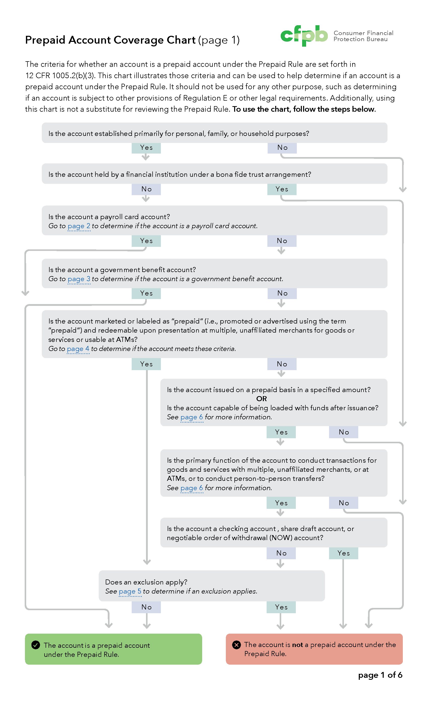
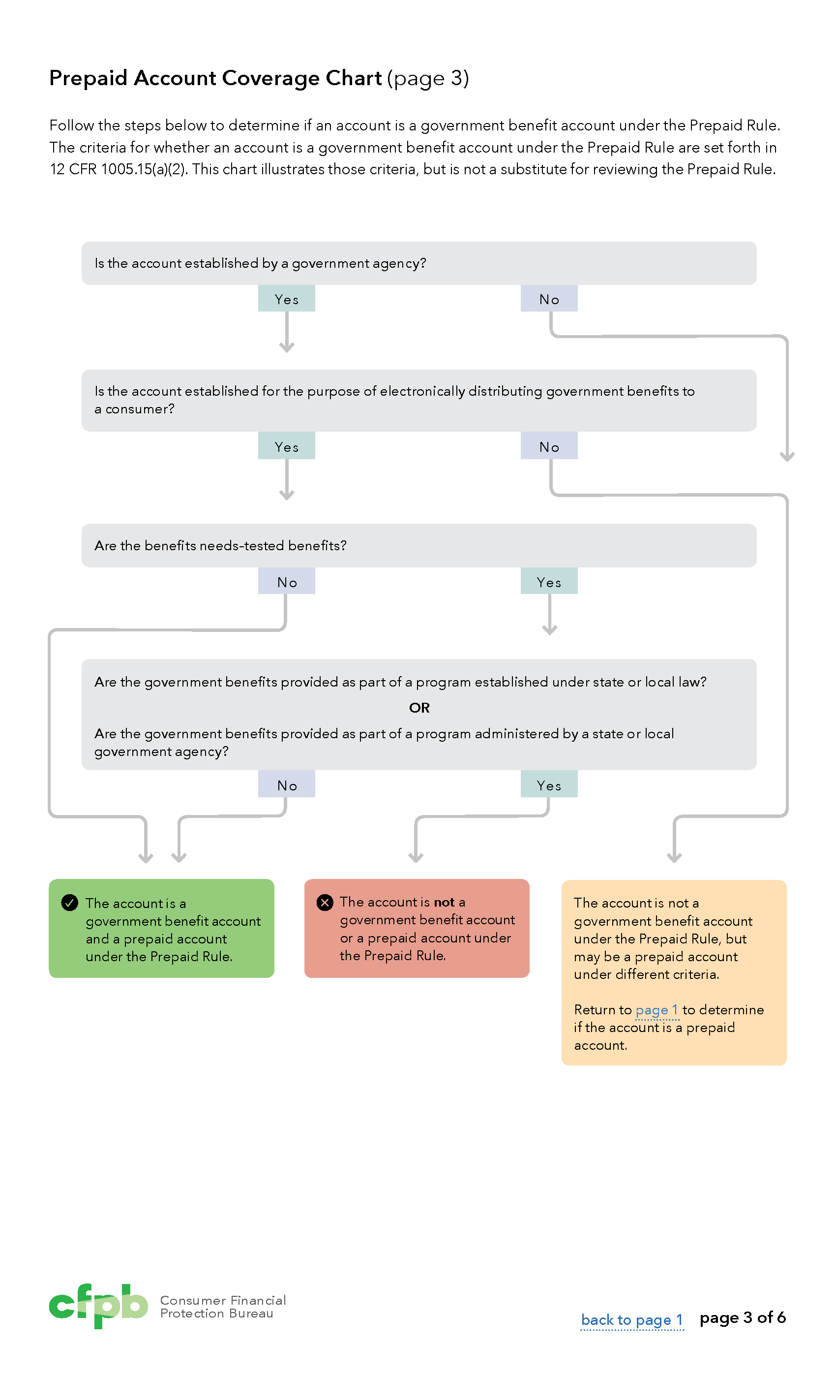
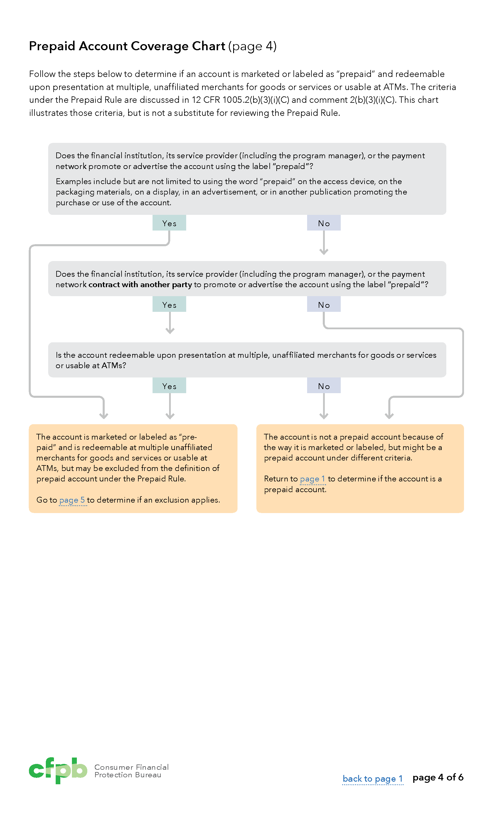
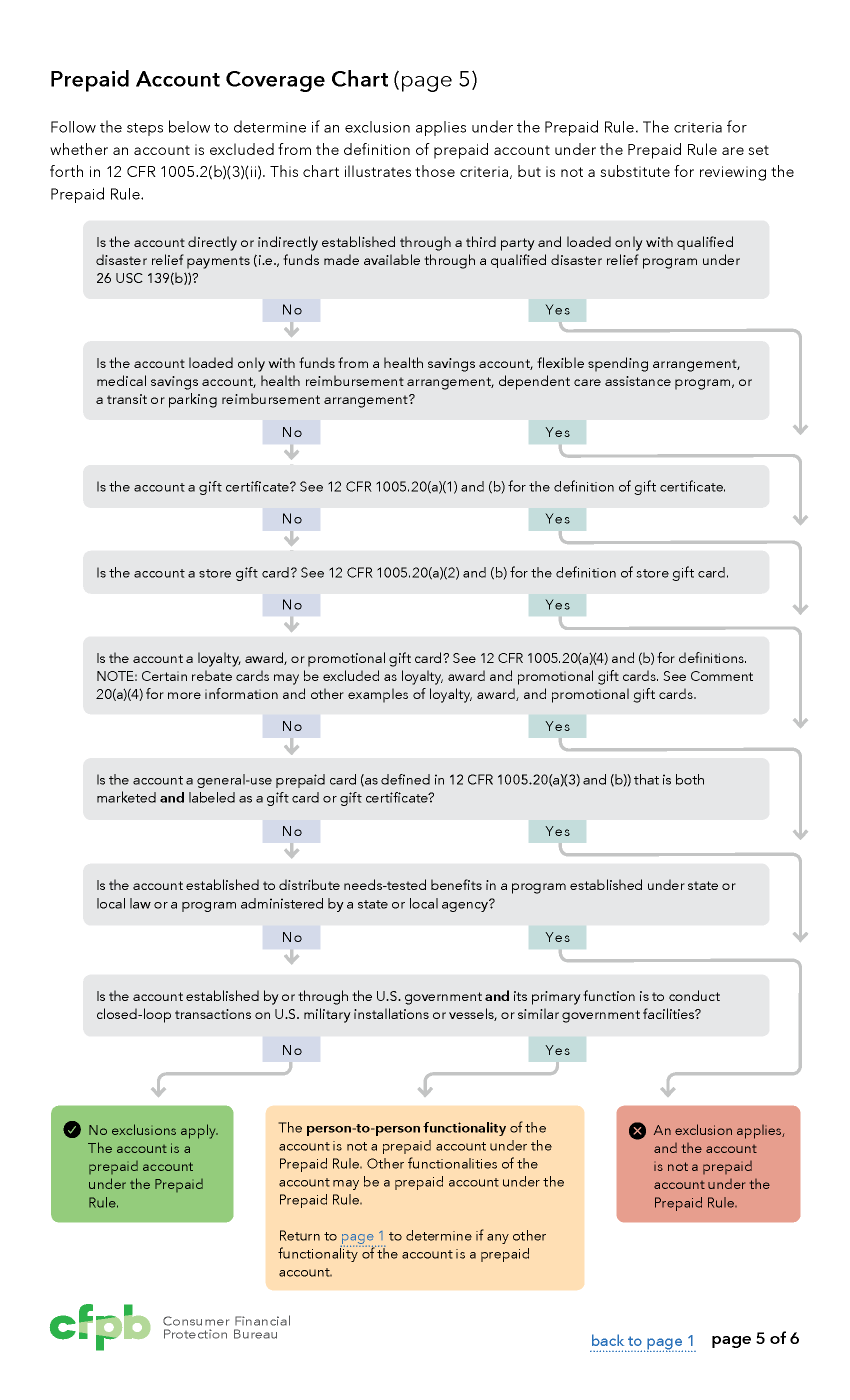
- Problem: The Bureau needed high level look to provide more information on when the rule should be followed. These complex charts need to be clear and printable because lawyers hang them up in their offices for easily access.
Adding subtle color to the yes/no boxes in the flowchart helps clarify the flow and makes it easier for users to recognize the difference between the options, because often a yes doesn't lead to a positive outcome.
Because of the success of this style, we've started to make similar flowcharts for more of our rules and regulations.
Curriculum Review Tool
- Stakeholders: Financial Education office at the CFPB
- Audience: Teachers and school administrators who want to implement a financial education program
- Problem: Multiple financial education curriculum exist and there needed to be a way to evaluate their effectiveness
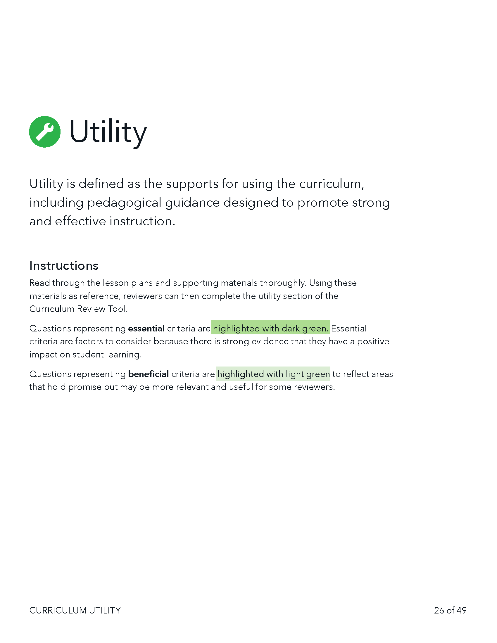
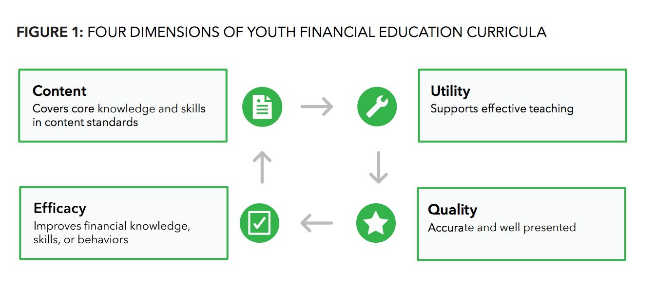
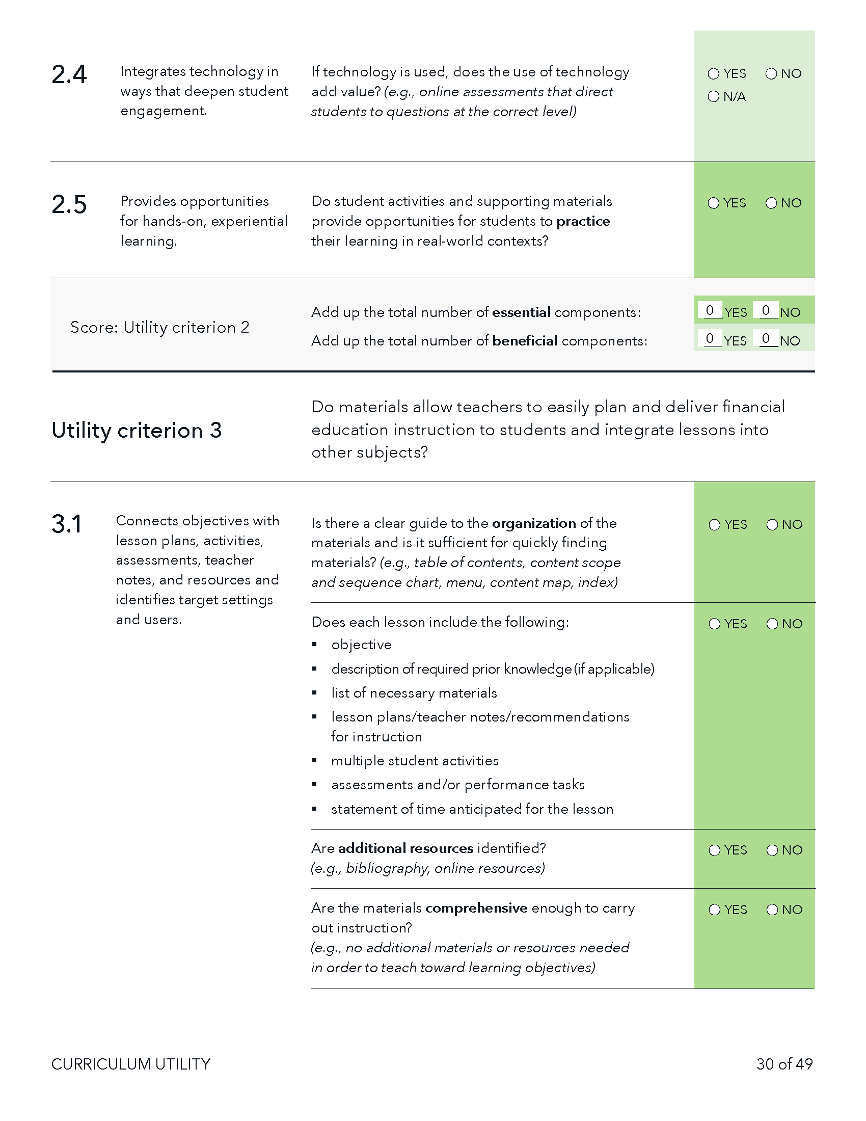
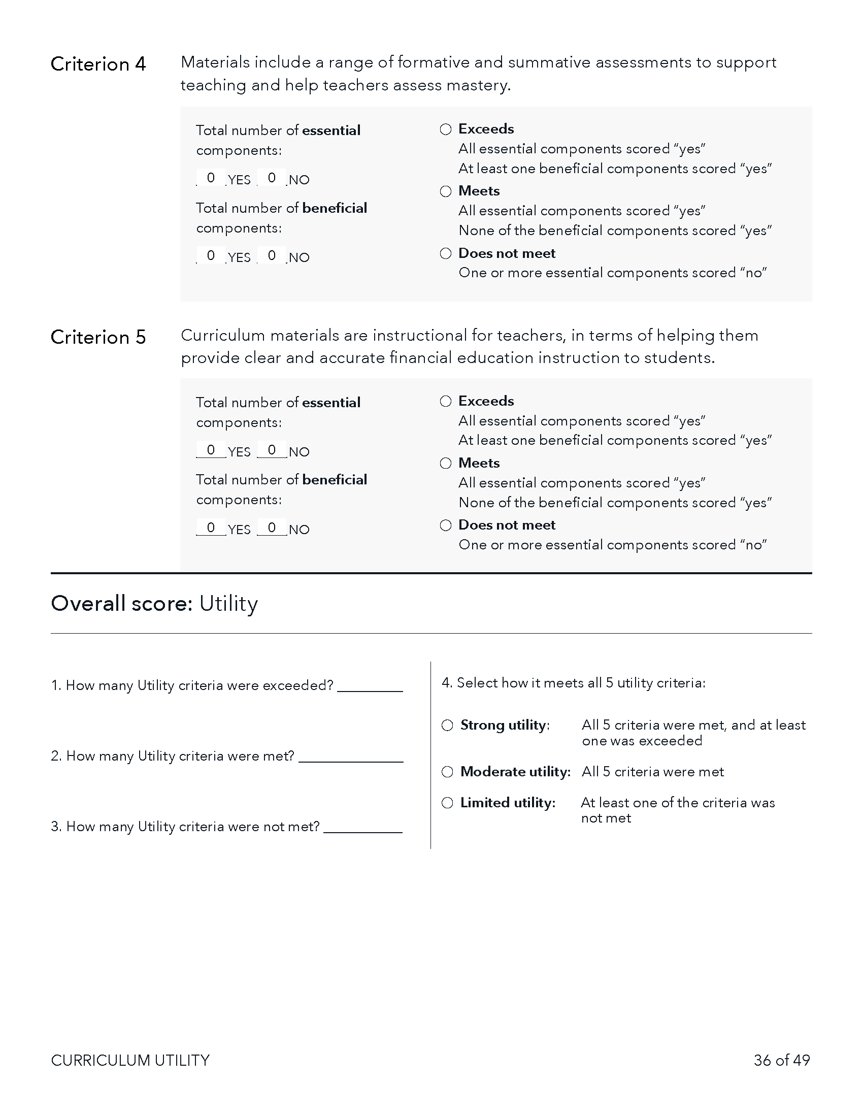
This is one of the more complex projects that I've worked on at the Bureau. It involved creating a simple system for a 4 part, 100+ question form that has 2 scoring metrics, and takes users 4+ hours to complete.
Because it takes people so much time to complete, it's rare that someone completes it in one sitting. We try to avoid unnecessary data collection about the public, so CFPB doesn’t have a log-in or save mechanism. The final tool is a 50 page fill-able pdf with JavaScript to automatically calculate scoring. It can also be printed and completed. Different shades of green subtlety distinguish the 2 different types of questions, and small icons work to identify the different sections.
Full PDF tool: files.consumerfinance.gov/f/201509_cfpb_youth-financial-education-curriculum-review.pdf
Guide for K-12 financial education resources
- Stakeholders: Financial Education office
- Audience: Educators and policymakers
- Problem: Making a 120 page guide of full of useful resources and case studies easy to parse
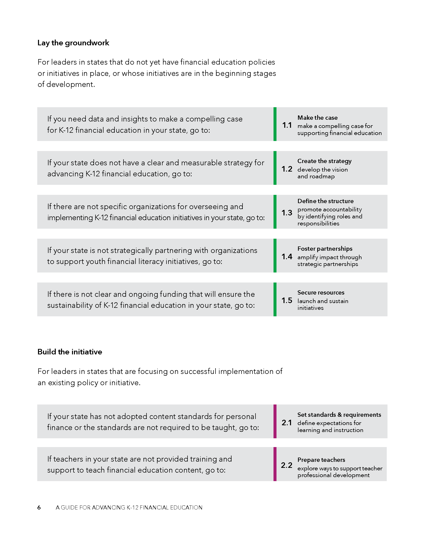
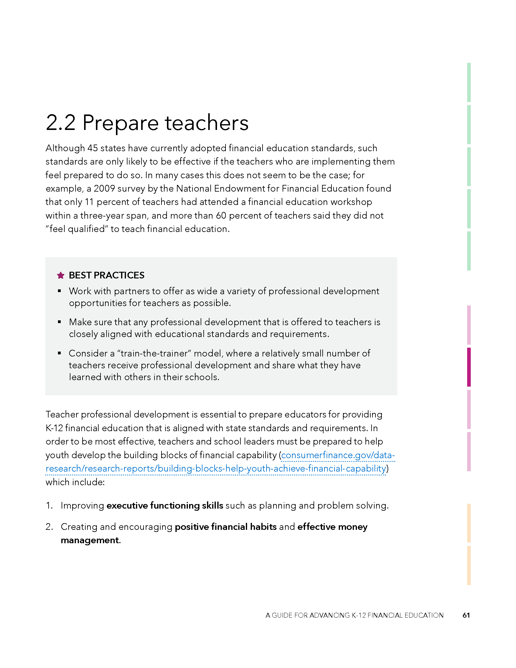
I created a system of mock tabs to help users navigate what section of the report they are in and to easily flip between sections. Color works to unify each section, and add visual interest. The report is broken into 3 sections with 11 subsections.
There's also a visual guide with questions in gray boxes that helps to connect users to the section that will meet their needs. Each section can also be broken out and distributed individually.
The result is a report that works better and more dynamically for its users. View the full report.


